Toolbars and Buttons
Toolbars
Most screens have toolbars on them. The whole toolbar line is split up into to 3 toolbars.
- History toolbar
- Center toolbar
- View toolbar
Toolbar for the particular context (page) is selected by
ApplicationHelper::ToolbarChooser. This module selects the right toolbars
based on a number of controller instance variables.
Toolbars are defined under app/helpers/application_helper/toolbar/. Each is a class of it’s own and it’s content is described by a simple DSL.
class ApplicationHelper::Toolbar::VmCloudsCenter < ApplicationHelper::Toolbar::Basic
  button_group('instance_vmdb', [
    select(
      :instance_vmdb_choice,
      'fa fa-cog fa-lg',
      t = N_('Configuration'),
      t,
      :enabled => false,
      :onwhen  => "1+",
      :items   => [
        button(
          :instance_refresh,
          'fa fa-refresh fa-lg',
          N_('Refresh relationships and power states for all items related to the selected items'),
          N_('Refresh Relationships and Power States'),
          :url_parms => "main_div",
          :confirm   => N_("Refresh relationships and power states for all items related to the selected items?"),
          :enabled   => false,
          :onwhen    => "1+"),
        button( ...
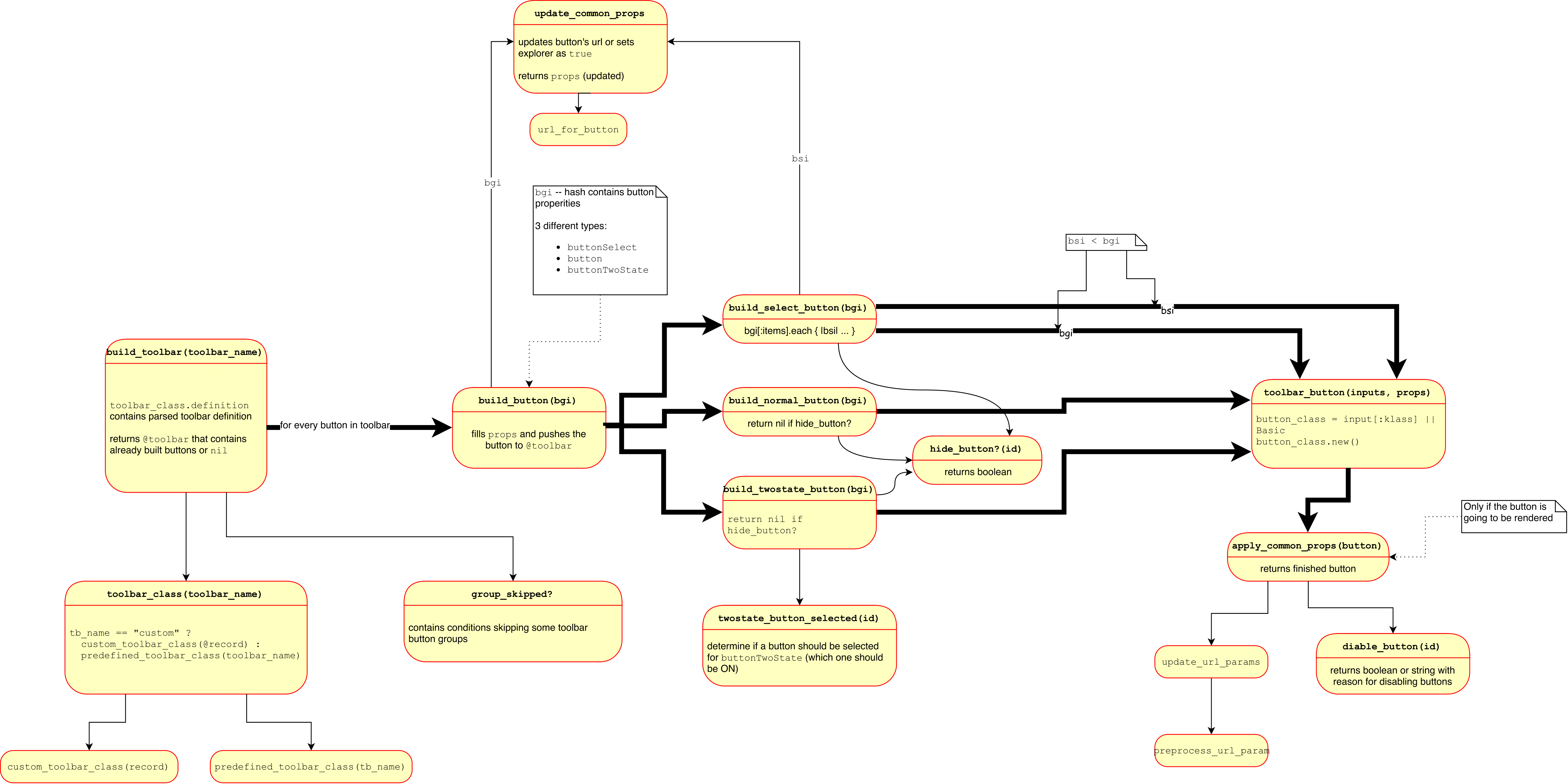
Toolbar building diagram

Buttons
Toolbars consist of button groups and button groups consist of buttons.
There are 3 types of buttons:
- normal “button” (
button) - dropdown “select” (
buttonSelect) - “twostate” (
buttonTwoState)
See ApplicationHelper::Toolbar::Basic for details.
The first 4 arguments for any of “button”, “select”, “twostate” are:
- identifier,
- text,
- hover text,
- icon.
Identifier identifies the button, button action. For normal and twostate buttons it matches RBAC feature that needs to exist. See RBAC feature.
In toolbar definitions text and hover text need to be marked for translation with N_() (see
Internationalization Guidelines). Values for these can also be a
Proc. In that case the given proc is evaled in a context where many controller
instance variables are present and can be used to determine the values of the
texts.
Further values have to be passed in as hash. In the example above it is
:url\_parms,:confirm,:enabled,:onwhen.
Very important key is
- :
klass.
Toolbars are rendered by the ManageIQ using the MiqToolbar component. That in turn uses the Toolbar and other components from the react-ui-components repository.
MiqToolbar also calls custom toolbars such as the DashboardToolbar.
Button details
For some buttons more complex logic is needed to decide if they should be displayed and enabled and what are the texts etc. In this case we use the key :klass to determine a button class that implements the behavior.
These button classes live under app/helpers/application_helper/button and are descendants of ApplicationHelper::Toolbar::Basic.
Important subclasses include e.g. ApplicationHelper::Button::ReadOnly and very important ApplicationHelper::Button::GenericFeatureButton.
ApplicationHelper::Button::GenericFeatureButton is a button that implements
logic to test if active entity in the UI such as VM, Host, Instance, Storage,
etc. has particular feature.
Example usage:
button(
  :vm_collect_running_processes,
  'fa fa-eyedropper fa-lg',
  N_('Extract Running Processes for this VM'),
  N_('Extract Running Processes'),
  :confirm => N_("Extract Running Processes for this VM?"),
  :klass => ApplicationHelper::Button::GenericFeatureButtonWithDisable,
  :options => {:feature => :collect_running_processes}),
The feature to be tested is passed in the :options hash as :feature. All content of the :options is passed to the Button classes and can be used to parametrize generic button classes.
Javascript-only buttons
You can create buttons that don’t need a client–server roundtrip when pressed. Such buttons instead call some javascript function, talk to Angular components or send RxJS messages to perform their action.
Example of such button definition:
  button_group('middleware_server_operations', [
    select(
      :middleware_server_power_choice,
      'fa fa-power-off fa-lg',
      t = N_('Power'),
      t,
      :items => [
        button(
          :middleware_server_shutdown,
          nil,
          N_('Gracefully shut this server down'),
          N_('Gracefully shutdown Server'),
          :image => 'guest_shutdown',
          :data  => {'toggle'        => 'modal',
                     'target'        => '#modal_param_div',
                     'function'      => 'sendDataWithRx',
                     'function-data' => '{"type": "mwServerOps", "operation": "shutdown", "timeout": 0}'},
          :klass => ApplicationHelper::Button::MiddlewareStandaloneServerAction),
...
Under :data you need to set 2 important keys:
:function, defines javascript function to be called when the button is pressed,:function-data, defines arguments to be passed to the function.
